BRAND • DESIGN • IDEAS
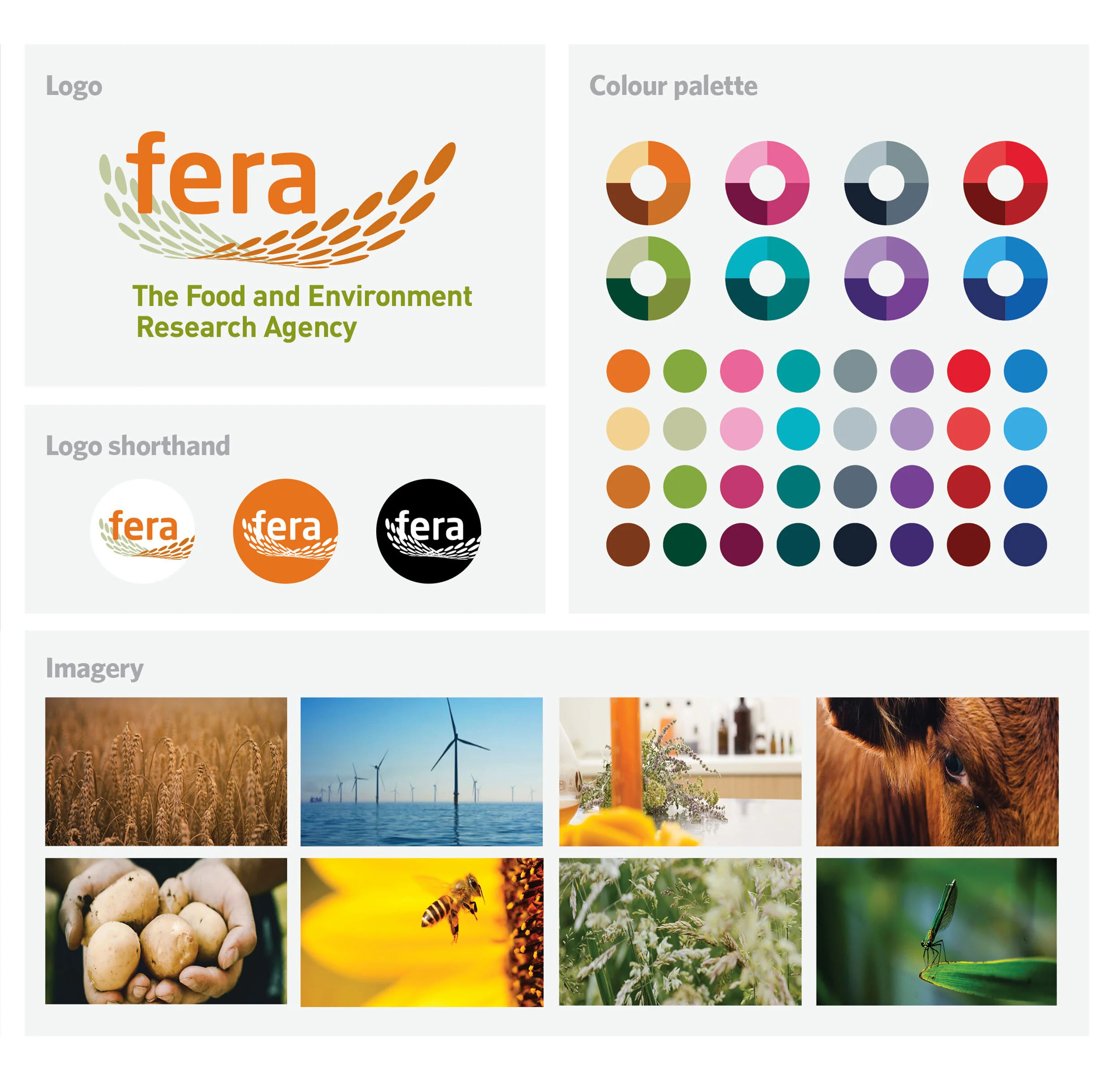
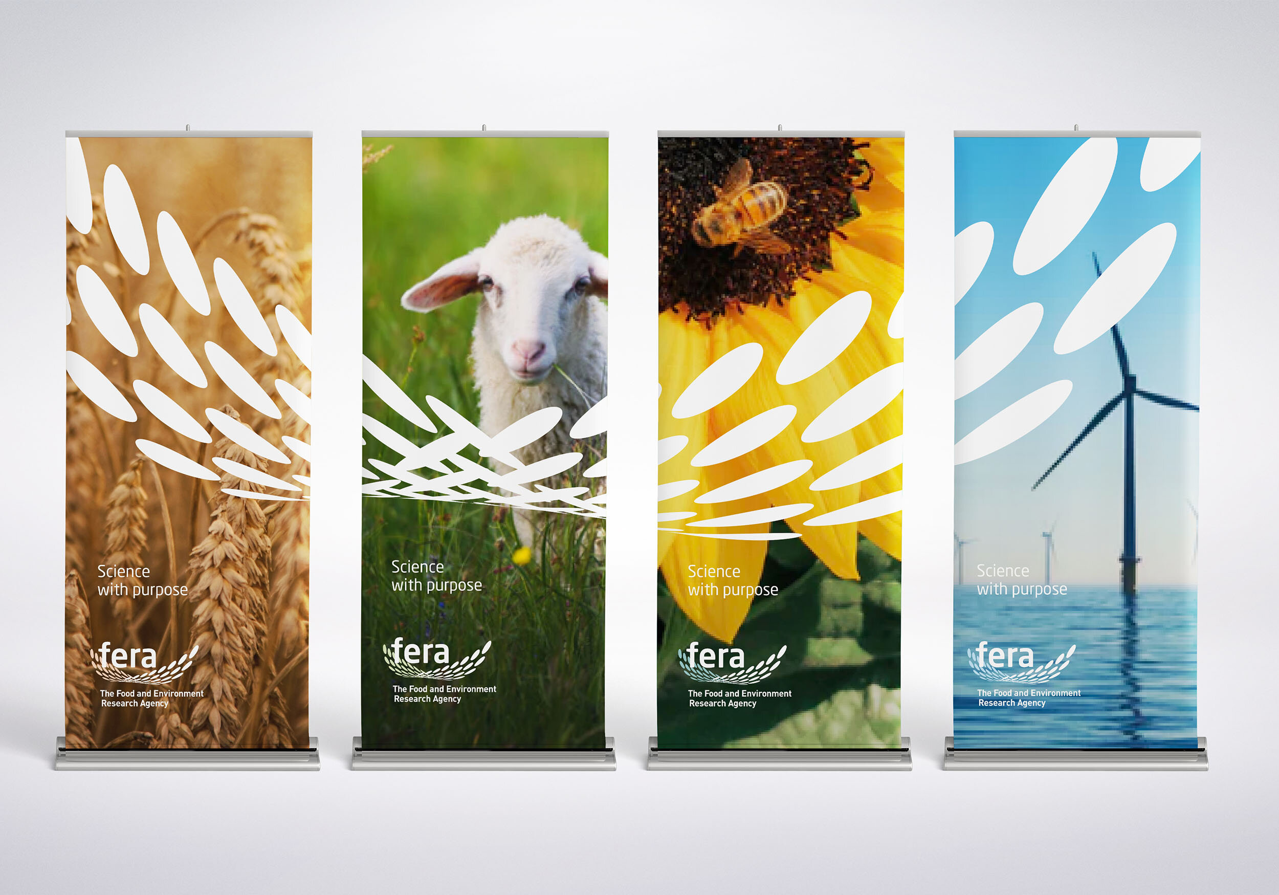
Defra was merging three of their government bodies – Central Science Laboratory, The Plant Health & Seeds Inspectorate and Plant Variety & Seeds to form a new commercially viable executive agency and therefore needed a new name and brand to reflect this.
A bespoke methodology was used to understand the three different parts of the new organisation, comprising a detailed brand audit, customer experience review, competitor and sector analysis, stakeholder interviews and c-suite workshops. From insights discovered the brand’s strategy elements (purpose, essence, function, values/personality) were defined.
A naming workshop and name creation employee competition delivered options that were trademark-searched. Three concepts were produced and the chosen logo and visual identity were created for different media.
The brand is now internationally recognised in its industry. The visual identity here has recently been re-imagined to reflect the current market.
“Thank you for translating our diverse minds into a coherent brand that is fresh, relevant and strong.” Rod Anson, Commercial Development Manager, fera
Role: Creative Lead.
Expertise: Brand Strategy, naming, workshops, concepting, logo creation and animation, visual identity, brand guidelines, brand application and art direction.
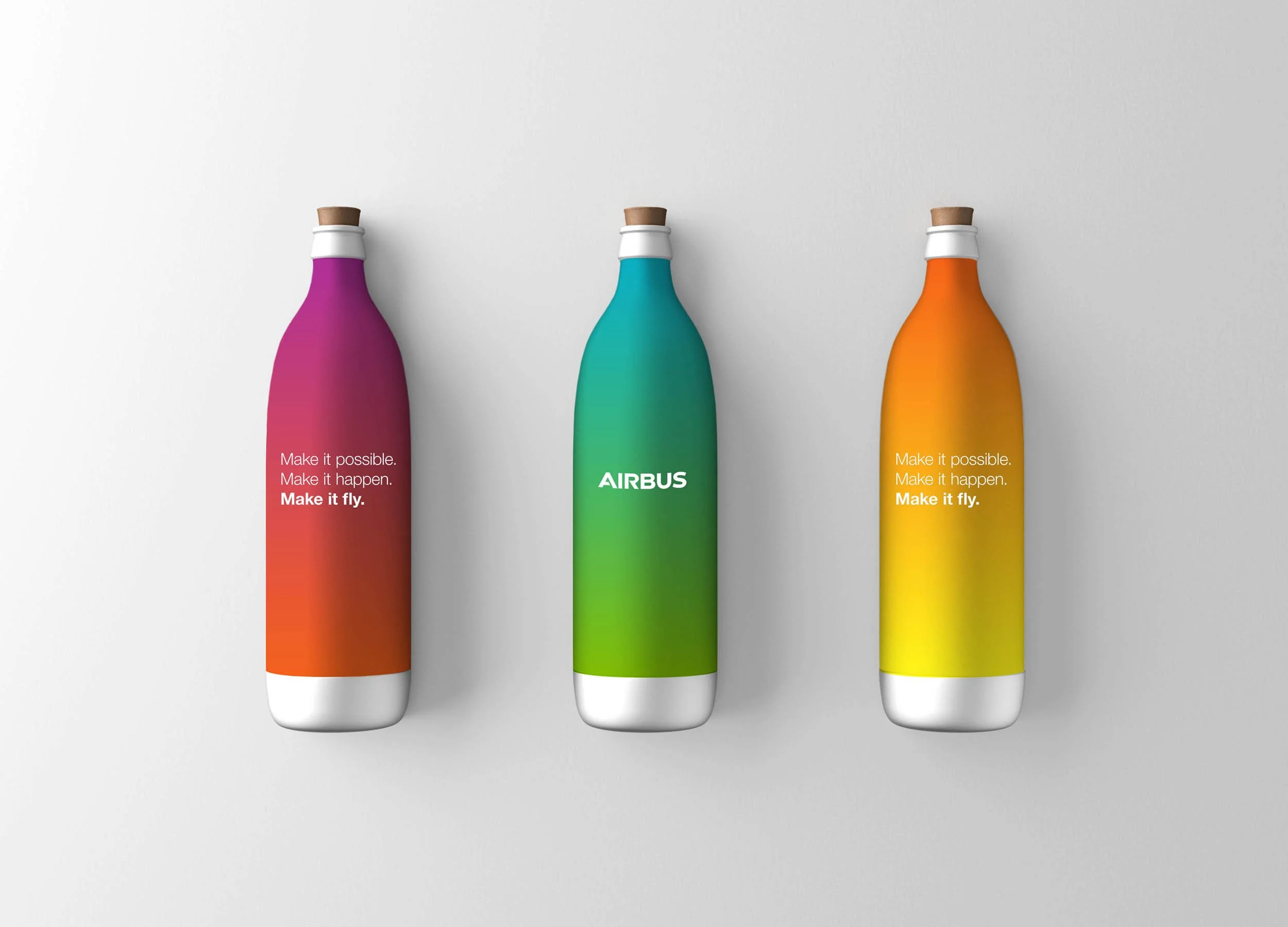
Airbus wanted to inspire and attract the next generation of tech innovators and entrepreneurs, as well as re-engaging with their global workforce.
This concept speaks to the ‘Why’ Airbus does what it does, drawing attention to how they make a difference to people’s lives every day by creating products that make the world a safer, smarter and more connected place.
This story, together with a unique and modern visual identity style, repositioned Airbus to not only stand out from their competitors but also to compete with new tech companies.
Role: Creative Lead.
Expertise: strategy, ideation, branding, design, art direction, copywriting and client management.
From top: *Shape* and Pulse logos for architects, PDP London: bySteffani logo for a boutique fashion brand: Lumyn Associates new logo; School for Wellbeing master logo: Tesco Health Suncare campaign logo; Premier Foods Mr. Kipling’s Brand Relaunch logo; No. 10 and the Cabinet Office’s branding to Building Britian’s Future through capital investment; Ministry of Justice re-brand for Her Majesty’s Inspectors of Constabularies; UKaid logo for DIFD to identify the UK’s international funding of aid; quality mark for the Green Deal energy-saving initiative to help consumers identity official providers and installers; The Governments IT Profession branding and The Knowledge Garden logo for IBM.
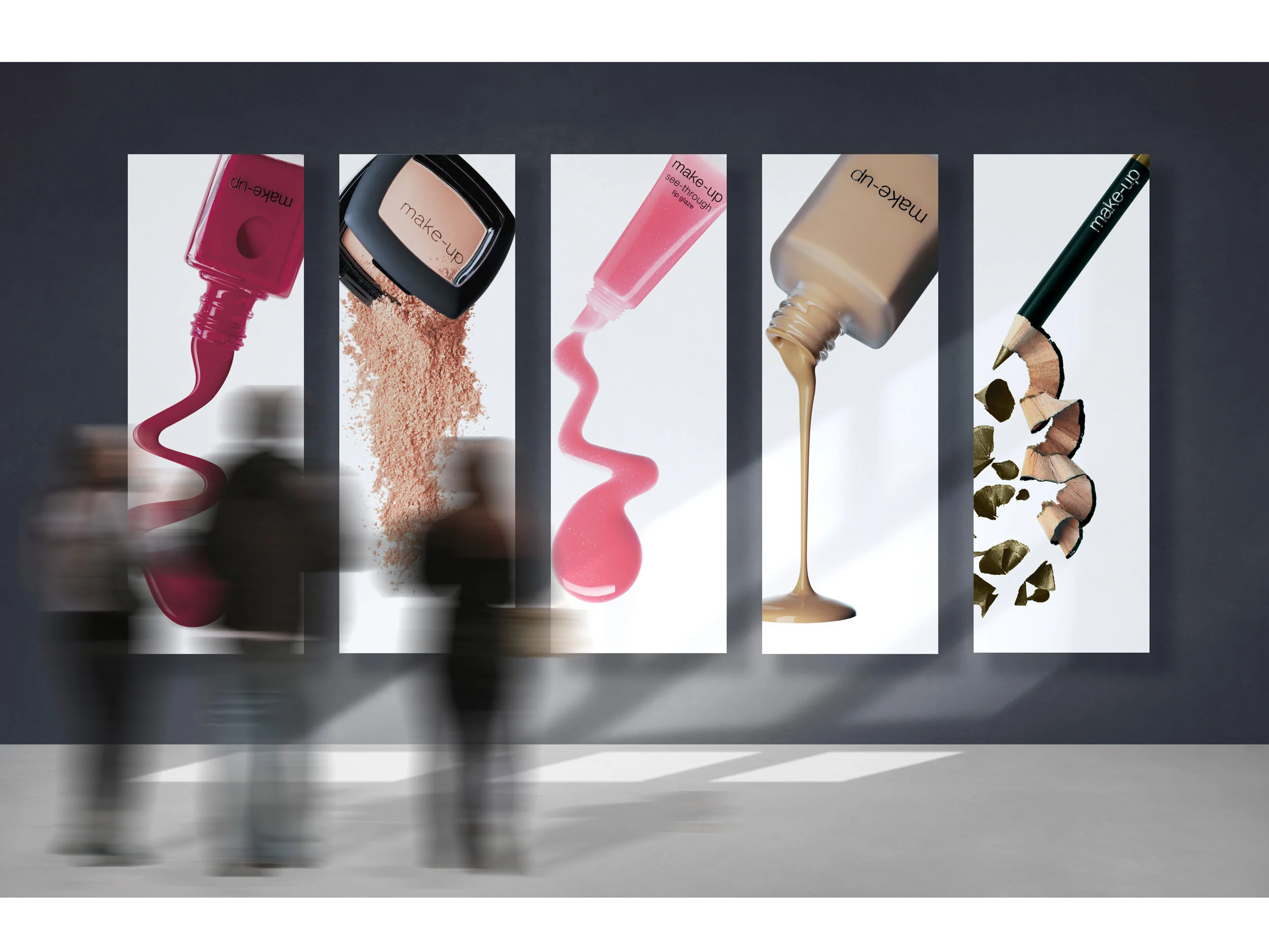
Tesco’s Supermarket created a new own-brand cosmetics range in partnership with the professional make-up artist Barbara Daly. They wanted to make a big splash and launch this extensive range of products, positioning it as a high-end modern brand that’s accessible to all.
The concept is about heroing the products in a fresh and fun way. The photography brings the products to life reflecting a fun, energetic, and playful tone. The logo and visual identity expresses the full palette of colours like a swatch chart building out from the master logo. The identity was rolled out across multiple communications including merchandise, clothing and product cards.
Role: Design Lead.
Skills: logo & identity creation, visualisation, brand design, photo retouching, and art direction.